- Matplotlib - Home
- Matplotlib - Introduction
- Matplotlib - Vs Seaborn
- Matplotlib - Environment Setup
- Matplotlib - Anaconda distribution
- Matplotlib - Jupyter Notebook
- Matplotlib - Pyplot API
- Matplotlib - Simple Plot
- Matplotlib - Saving Figures
- Matplotlib - Markers
- Matplotlib - Figures
- Matplotlib - Styles
- Matplotlib - Legends
- Matplotlib - Colors
- Matplotlib - Colormaps
- Matplotlib - Colormap Normalization
- Matplotlib - Choosing Colormaps
- Matplotlib - Colorbars
- Matplotlib - Working With Text
- Matplotlib - Text properties
- Matplotlib - Subplot Titles
- Matplotlib - Images
- Matplotlib - Image Masking
- Matplotlib - Annotations
- Matplotlib - Arrows
- Matplotlib - Fonts
- Matplotlib - Font Indexing
- Matplotlib - Font Properties
- Matplotlib - Scales
- Matplotlib - LaTeX
- Matplotlib - LaTeX Text Formatting in Annotations
- Matplotlib - PostScript
- Matplotlib - Mathematical Expressions
- Matplotlib - Animations
- Matplotlib - Celluloid Library
- Matplotlib - Blitting
- Matplotlib - Toolkits
- Matplotlib - Artists
- Matplotlib - Styling with Cycler
- Matplotlib - Paths
- Matplotlib - Path Effects
- Matplotlib - Transforms
- Matplotlib - Ticks and Tick Labels
- Matplotlib - Radian Ticks
- Matplotlib - Dateticks
- Matplotlib - Tick Formatters
- Matplotlib - Tick Locators
- Matplotlib - Basic Units
- Matplotlib - Autoscaling
- Matplotlib - Reverse Axes
- Matplotlib - Logarithmic Axes
- Matplotlib - Symlog
- Matplotlib - Unit Handling
- Matplotlib - Ellipse with Units
- Matplotlib - Spines
- Matplotlib - Axis Ranges
- Matplotlib - Axis Scales
- Matplotlib - Axis Ticks
- Matplotlib - Formatting Axes
- Matplotlib - Axes Class
- Matplotlib - Twin Axes
- Matplotlib - Figure Class
- Matplotlib - Multiplots
- Matplotlib - Grids
- Matplotlib - Object-oriented Interface
- Matplotlib - PyLab module
- Matplotlib - Subplots() Function
- Matplotlib - Subplot2grid() Function
- Matplotlib - Anchored Artists
- Matplotlib - Manual Contour
- Matplotlib - Coords Report
- Matplotlib - AGG filter
- Matplotlib - Ribbon Box
- Matplotlib - Fill Spiral
- Matplotlib - Findobj Demo
- Matplotlib - Hyperlinks
- Matplotlib - Image Thumbnail
- Matplotlib - Plotting with Keywords
- Matplotlib - Create Logo
- Matplotlib - Multipage PDF
- Matplotlib - Multiprocessing
- Matplotlib - Print Stdout
- Matplotlib - Compound Path
- Matplotlib - Sankey Class
- Matplotlib - MRI with EEG
- Matplotlib - Stylesheets
- Matplotlib - Background Colors
- Matplotlib - Basemap
- Matplotlib - Event Handling
- Matplotlib - Close Event
- Matplotlib - Mouse Move
- Matplotlib - Click Events
- Matplotlib - Scroll Event
- Matplotlib - Keypress Event
- Matplotlib - Pick Event
- Matplotlib - Looking Glass
- Matplotlib - Path Editor
- Matplotlib - Poly Editor
- Matplotlib - Timers
- Matplotlib - Viewlims
- Matplotlib - Zoom Window
- Matplotlib Widgets
- Matplotlib - Cursor Widget
- Matplotlib - Annotated Cursor
- Matplotlib - Buttons Widget
- Matplotlib - Check Buttons
- Matplotlib - Lasso Selector
- Matplotlib - Menu Widget
- Matplotlib - Mouse Cursor
- Matplotlib - Multicursor
- Matplotlib - Polygon Selector
- Matplotlib - Radio Buttons
- Matplotlib - RangeSlider
- Matplotlib - Rectangle Selector
- Matplotlib - Ellipse Selector
- Matplotlib - Slider Widget
- Matplotlib - Span Selector
- Matplotlib - Textbox
- Matplotlib Plotting
- Matplotlib - Line Plots
- Matplotlib - Area Plots
- Matplotlib - Bar Graphs
- Matplotlib - Histogram
- Matplotlib - Pie Chart
- Matplotlib - Scatter Plot
- Matplotlib - Box Plot
- Matplotlib - Arrow Demo
- Matplotlib - Fancy Boxes
- Matplotlib - Zorder Demo
- Matplotlib - Hatch Demo
- Matplotlib - Mmh Donuts
- Matplotlib - Ellipse Demo
- Matplotlib - Bezier Curve
- Matplotlib - Bubble Plots
- Matplotlib - Stacked Plots
- Matplotlib - Table Charts
- Matplotlib - Polar Charts
- Matplotlib - Hexagonal bin Plots
- Matplotlib - Violin Plot
- Matplotlib - Event Plot
- Matplotlib - Heatmap
- Matplotlib - Stairs Plots
- Matplotlib - Errorbar
- Matplotlib - Hinton Diagram
- Matplotlib - Contour Plot
- Matplotlib - Wireframe Plots
- Matplotlib - Surface Plots
- Matplotlib - Triangulations
- Matplotlib - Stream plot
- Matplotlib - Ishikawa Diagram
- Matplotlib - 3D Plotting
- Matplotlib - 3D Lines
- Matplotlib - 3D Scatter Plots
- Matplotlib - 3D Contour Plot
- Matplotlib - 3D Bar Plots
- Matplotlib - 3D Wireframe Plot
- Matplotlib - 3D Surface Plot
- Matplotlib - 3D Vignettes
- Matplotlib - 3D Volumes
- Matplotlib - 3D Voxels
- Matplotlib - Time Plots and Signals
- Matplotlib - Filled Plots
- Matplotlib - Step Plots
- Matplotlib - XKCD Style
- Matplotlib - Quiver Plot
- Matplotlib - Stem Plots
- Matplotlib - Visualizing Vectors
- Matplotlib - Audio Visualization
- Matplotlib - Audio Processing
- Matplotlib Useful Resources
- Matplotlib - Quick Guide
- Matplotlib - Cheatsheet
- Matplotlib - Useful Resources
- Matplotlib - Discussion
Matplotlib Cheatsheet
The Matplotlib Cheatsheet provides fundamental references to all its topics. It is a set of tools for creating high-quality 2D and 3D plots, charts, and graphs. In data analysis and visualization tasks, people often combine Matplotlib with other popular data science libraries like NumPy, Pandas, and Scikit-learn. By learning this cheat sheet, one can easily visualize the data from the given datasets. Go through this cheat sheet and learn the Matplotlib library of Python.
1. Basic overview of Matplotlib
In the basic overview of Matplotlib, we are providing basic key features and components of plotly library −
- Figure : The figure is the top-level container for all the elements of a plot. This represent the entire window or plot.
- Axes : Axes are the areas within a figure where the actual data is plotted.
- Plotting Function : These are specific function provided by the matplotlib to create various types of graph. Some of the common function are plot(), scatter(), bar(), and hist().
- Labels and Titles : This provides the context to the plot.
- Legends : This is a small box that identifies the different data series in a plot.

2. Subplots layout in Matplotlib
In matplotlib, the subplot layout refers to the arrangement of multiple subplots within a single figure.
plt.subplot(nrows, ncols, index)
3. Basic plots of Matplotlib
In the basic plots of Matplotlib, we provides various ways to visualize data using different types of graphs and charts.
i. Matplotlib − plot()
The plot() function is used to create line plots.
import matplotlib.pyplot as plt
x = [1, 2, 3, 5]
y = [7, 8, 9, 10]
plt.plot(x, y)
plt.show()
ii. Matplotlib − scatter()
The scatter() function is used to create scatter plots, which represent individual data points.
import matplotlib.pyplot as plt
x = [1, 2, 3, 5]
y = [7, 8, 9, 10]
plt.scatter(x, y)
plt.show()
iii. Matplotlib − imshow()
The imshow() function displays image data as a 2D rasterized grid.
import matplotlib.pyplot as plt
import numpy as np

# Create a 2D array
data = np.random.rand(10, 10)

# Display the data as an image
plt.imshow(data, cmap='viridis', interpolation='nearest')

# Add a colorbar to show the scale
plt.colorbar()

# Add labels and title
plt.title('Random 2D Data Visualization')
plt.xlabel('X-axis')
plt.ylabel('Y-axis')

# Show the plot
plt.show()
The above code produces the following output −

iv. Matplotlib − contour()
The contour() function is used to create contour plots for visualizing 3D data in 2D.
contour(X, Y, Z, levels=None, **kwargs)
v. Matplotlib − pcolormesh()
The pcolormesh() function creates a pseudocolor plot with a non-regular rectangular grid.
pcolormesh(X, Y, C, **kwargs)
vi. Matplotlib − quiver()
The quiver() function is used to create vector field plots with arrows.
quiver(X, Y, U, V, **kwargs)
vii. Matplotlib − pie()
The pie() function is used to create pie charts.
import matplotlib.pyplot as plt
sizes = [15, 30, 45, 10]
labels = ['A', 'B', 'C', 'D']
colors = ['gold', 'lightcoral', 'lightskyblue', 'yellowgreen']

# Create a pie chart
plt.figure(figsize=(8, 6))
plt.pie(sizes, labels=labels, colors=colors, autopct='%1.1f%%', startangle=90)

# Equal aspect ratio ensures that pie is drawn as a circle
plt.axis('equal')
plt.title('Pie Chart')
plt.show()
viii. Matplotlib − text()
The text() function adds text annotations to plots.
import matplotlib.pyplot as plt

x = [1, 2, 3, 4, 5]
y = [2, 3, 5, 7, 11]
plt.plot(x, y, marker='o')

# Define the coordinates
text_x = 3
text_y = 5

# Add text to the plot
plt.text(text_x, text_y, 'Tutorialspoint', fontsize=12, color='green')

# Add labels and title
plt.xlabel('X-axis')
plt.ylabel('Y-axis')
plt.title('Text')

# Show the plot
plt.grid()
plt.show()
ix. Matplotlib − fill()
The fill() function is used to create filled area plots.
import matplotlib.pyplot as plt
x = [1, 2, 3, 4, 5]
y = [2, 3, 5, 7, 11]
plt.fill(x, y, color='blue', alpha=0.5)
plt.show()
4. Advanced plots of Matplotlib
Advanced plotting functions in Matplotlib allow for more complex data visualization, such as statistical and categorical plots.
i. step()
The step() function creates step plots, useful for visualizing discrete changes in data.
import matplotlib.pyplot as plt
x = [11, 2, 13, 4, 15]
y = [12, 3, 15, 7, 11]
plt.step(x, y, where='mid')
plt.show()
ii. boxplot()
The boxplot() function creates box-and-whisker plots to display data distribution.
import matplotlib.pyplot as plt
import numpy as np

# Generate random data
np.random.seed(42)
data = np.random.randn(100)

# Create a box plot
plt.boxplot(data, vert=True, patch_artist=True, boxprops=dict(facecolor="lightblue"))

# Add labels and title
plt.xlabel('Category')
plt.ylabel('Value')
plt.title('Box Plot')
plt.show()
iii. errorbar()
The errorbar() function adds error bars to a plot to show variability in data.
import matplotlib.pyplot as plt
import numpy as np

x = np.array([1, 2, 3, 4, 5])
y = np.array([10, 15, 13, 18, 14])

# Error values
y_err = np.array([1, 2, 1.5, 2.5, 1])

# Create Error Bar Plot
plt.errorbar(x, y, yerr=y_err, fmt='o', capsize=5, label="Data with Error Bars")

# Labels and Title
plt.xlabel("X-axis")
plt.ylabel("Y-axis")
plt.title("Error Bar Plot")
plt.legend()
plt.show()
The above code produces the following output −

iv. hist()
The hist() function creates histograms to represent frequency distributions.
import matplotlib.pyplot as plt
import numpy as np
# Generate random data
data = np.random.randn(1000)
# Create a histogram
plt.hist(data, bins=30, edgecolor='black', alpha=0.7)
# Add labels and title
plt.xlabel('Value')
plt.ylabel('Frequency')
plt.title('Histogram')
plt.show()
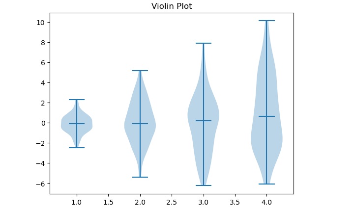
v. violinplot()
The violinplot() function creates violin plots to show data distribution and density.
import matplotlib.pyplot as plt
import numpy as np

# Generating data with different standard deviations
data = [np.random.normal(0, std, 100) for std in range(1, 5)]

# Creating a basic violin plot
plt.violinplot(data, showmeans=False, showmedians=True)
plt.title('Violin Plot')
plt.show()
The above code produces the following result −
vi. barbs()
The barbs() function is used for meteorological wind barbs plotting.
import matplotlib.pyplot as plt
import numpy as np

# Create a grid of points
X, Y = np.meshgrid(np.arange(0, 10, 1), np.arange(0, 10, 1))

U = np.cos(X)
V = np.sin(Y)

# Create the barb plot
plt.figure(figsize=(6,6))
plt.barbs(X, Y, U, V, length=6)

# Add title
plt.title('Barb Plot')
plt.show()
vii. eventplot()
The eventplot() function is used to visualize event data as vertical or horizontal lines.
import matplotlib.pyplot as plt
import numpy as np

# Generate random event data
np.random.seed(42)
data = [np.random.rand(10) * 10 for _ in range(5)]

# Create the event plot
plt.eventplot(data, orientation='horizontal', colors=['r', 'g', 'b', 'c', 'm'])

# Add labels and title
plt.xlabel('Time')
plt.ylabel('Event Groups')
plt.title('Event Plot')

# Show the plot
plt.show()
viii. hexbin()
The hexbin() function creates hexagonal binning plots for visualizing dense scatter plots.
import matplotlib.pyplot as plt
x = [11, 2, 13, 4, 15]
y = [12, 3, 15, 7, 11]
plt.hexbin(x, y, gridsize=30, cmap='Blues')
plt.colorbar()
plt.show()
5. Scale and its types
Scales define how data values are mapped to the visual representation in a plot. Matplotlib supports linear, logarithmic, symmetric log, and logit scales.
import matplotlib.pyplot as plt
plt.xscale('log')
plt.yscale('linear')
plt.show()
6. Projection
Projection in Matplotlib is mainly used for 3D plotting or changing coordinate systems, such as polar projection.
import matplotlib.pyplot as plt
fig = plt.figure()
ax = fig.add_subplot(111, projection='polar')
plt.show()
7. Matplotlib Lines
Lines in Matplotlib are used to connect data points. Here, we can customize them with different styles, widths, and colors.
import matplotlib.pyplot as plt
x = [11, 2, 13, 4, 15]
y = [12, 3, 15, 7, 11]
plt.plot(x, y, linestyle='dashed', linewidth=2, color='green')
plt.show()
8. Markers in Matplotlib
Markers highlight specific data points in a plot, such as dots, squares, or stars.
import matplotlib.pyplot as plt
x = [11, 2, 13, 4, 15]
y = [12, 3, 15, 7, 11]
plt.plot(x, y, marker='o', markersize=8, markerfacecolor='grey')
plt.show()
9. Colors in Matplotlib
Matplotlib allows defining colors using names, RGB, HEX codes, or colormaps.
import matplotlib.pyplot as plt
x = [21, 2, 1, 41, 15]
y = [12, 13, 15, 17, 11]
plt.plot(x, y, color='#FF5733')
plt.show()
10. Colormaps
Colormaps are gradients used for visualizing intensity variations, commonly in heatmaps and contour plots.
import matplotlib.pyplot as plt
x = [21, 2, 1, 41, 15]
y = [12, 13, 15, 17, 11]
plt.imshow(data, cmap='plasma')
plt.colorbar()
plt.show()
The above code produces the following result −

11. Colorbars
A colorbar is an indicator for the values represented by colors in a plot.
import matplotlib.pyplot as plt
plt.imshow(data, cmap='viridis')
plt.colorbar()
plt.show()

12. Matplotlib - Tick Locators
Tick locators control the placement of tick marks on axes, which can be automatic or manually set.
import matplotlib.pyplot as plt
from matplotlib.ticker import MultipleLocator
plt.gca().xaxis.set_major_locator(MultipleLocator(2))
plt.show()
13. Matplotlib - Tick Formatters
Tick formatters control how tick labels are displayed, allowing customization of numerical or date-based labels. Here is the syntax of the tick formmatter −
import matplotlib.ticker as ticker

# Using FormatStrFormatter
ax.xaxis.set_major_formatter(ticker.FormatStrFormatter('%.2f'))

# Using FuncFormatter
ax.xaxis.set_major_formatter(ticker.FuncFormatter(lambda x, pos: f'{x:.1f} units'))
14. Legend
A legend provides descriptions for different elements in a plot.
import matplotlib.pyplot as plt
x = [21, 2, 1, 41, 15]
y = [12, 13, 15, 17, 11]
plt.plot(x, y, label='Legend')
plt.legend()
plt.show()
15. Fonts
Here, we can customize font styles and sizes in Matplotlib.
import matplotlib.pyplot as plt
plt.xlabel('X-axis', fontsize=14, fontfamily='Monospace')
plt.show()
16. Event handling
Matplotlib allows event handling for user interactions like mouse clicks or key presses using event listeners.
import matplotlib.pyplot as plt
def on_click(event):
    print(f'Clicked at ({event.xdata}, {event.ydata})')

fig, ax = plt.subplots()
fig.canvas.mpl_connect('button_press_event', on_click)
plt.show()
17. Grid
Grid lines make it easier to read values on the plot by adding horizontal and vertical reference lines.
import matplotlib.pyplot as plt
plt.grid(True, linestyle='--', alpha=0.7)
plt.show()
18. Axis Ranges
User can manually set the axis range of x and y axes to zoom in or focus on specific data.
import matplotlib.pyplot as plt
plt.xlim(0, 10)
plt.ylim(0, 50)
plt.show()